The quality of users' experience with your website is the deciding factor of its success. If visitors are able to use your site quickly and without problems, they are likely to return. On the other hand, if your site is confusing and frustrating to use, they'll be happy to find a better one. Your user interface can make or break your website, so here are some tips to ensure that yours is the best it can be.
1. Keep Navigation Clear
A clear navigation system is one of the main ingredients for a positive user experience. To achieve this, focus on these aspects:
Create a hierarchical structure
The natural way to view a webpage is to scan its contents, so use design elements with the intention to help guide viewers' eyes. This includes displaying conventional navigational elements, like category organization and a search bar at the top. Internet users are accustomed to finding these functions in similar places on every website, so to change that can create unnecessary confusion.
Use strategic spacing and placement
Spacing can play a huge role in guiding your user's eye and bringing attention to certain elements. For example, a product page should have equal spacing throughout so that each product is emphasized equally, and calls-to-action can be separated from other design elements with more space so they stand out more prominently.
Personalize
Though it's not a good idea to go too crazy with an unconventional navigation system, you can still design its elements to reflect your brand. Feel free to get creative with the way you visually present your navigation; just remember to keep it clear so that visitors know what to do.
Get millions of stock images and videos at the best price
Unlimited access. No attribution required. Starts at just $9/month.

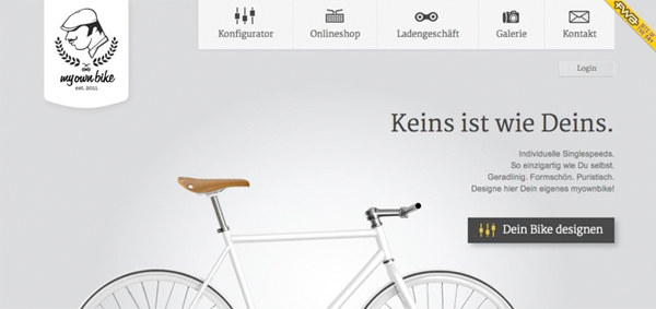
My Own Bike uses a conventional menu bar at the top of the page, but the options are supplemented with icons that are consistent with the brand's image. They add uniqueness to the menu, as well as a universal communication aspect. The white space then draws attention to the product on the page, and the call-to-action is set aside. All of these characteristics make for a cohesive design that tells the viewer exactly where to look and what to do.
2. Simplify Everything
Navigation isn't the only part of your website that should be simple. A good experience depends on a site that enables users to quickly find what they're looking for without having to cross barriers to get there. Simplifying your site includes cutting out any clutter in the design that could distract visitors from the main goal of your site.
Color scheme
A growing trend is to employ a neutral color scheme, with an accent color to highlight important elements. This is effective in creating a clean and professional image of your brand, and makes it easy for users to take in everything on the page.
Layout and text
The layout of your pages can be simplified by using white space and type variations to create a visual hierarchy. Space can emphasize design elements, and text can be accentuated by using different fonts, weights, sizes and colors.
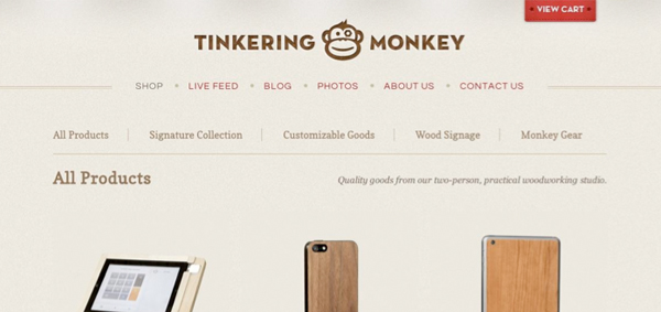
Tinkering Monkey is a good example of a neutral color scheme with a highlighting pop of color. The cream-colored background puts the products in a place of high visual importance, and the red draws attention to the menu items and shopping cart, which all make for an attractive and minimal design.
3. Find A Balance of Text and Imagery
Website imagery can be presented in many forms, including photography, illustration and iconography. Strong imagery often speaks for itself, but to make sure users understand its message, it's a good idea to supplement them with text to provide further information.
If you use photography, photos should be of high quality; if you're not a photographer yourself, a great option is to use stock photography. Iconography is another way to communicate a message through imagery. Icons are classically minimal illustrations that ideally show a universal image to help guide users through your site. Here are some icon design tips to help you communicate clearly with icons.
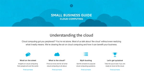
Xero incorporates a lot of simple, minimal icons that are really effective in aiding their written copy – allowing for an easier, more engaging read.
When testing and tweaking your website, keep these tips in mind to improve the interaction your visitors have with your site.
