We’re excited to share a new visual identity with our community! This latest evolution of our brand, which includes an updated logo, new brand colors, and new typeface, better reflects who we are and what we do.
Logo and Colors
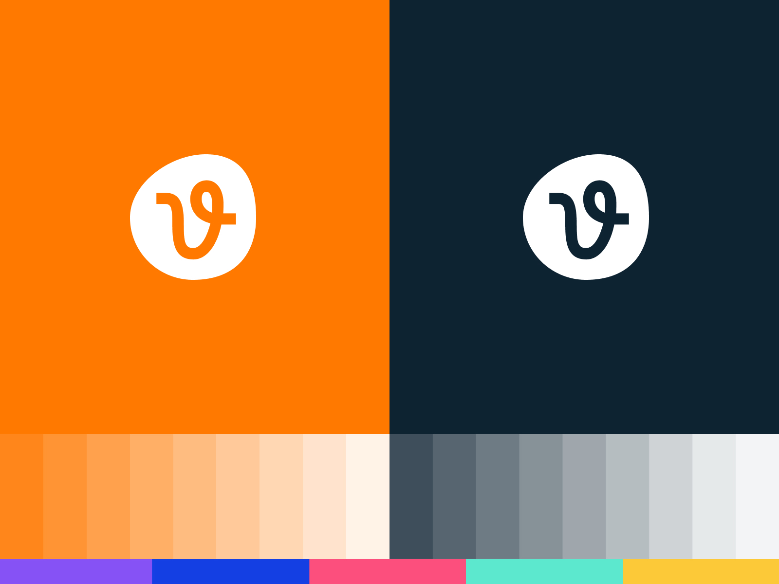
Our new logo is called The Path. It stands for: Inspiration, Guidance, and Creativity.

Our primary colors are orange, navy, and white. The neutral colors are based solely on the navy in the core palette. While most applications will use white, orange, and navy, a larger palette that includes secondary colors will be used to bring in more diversity.


Purpose
Our purpose is to inspire and simplify your creative process, giving you the resources you need to do your best work. To that end, we have refined our branding so we can better guide you along your creative journey.
For those who heed the call to create, one thing is certain: The creative journey is never a straight line. We provide creators with the resources they need to do their best work, wherever they are in the creative process. To us, that is a straightforward path. We help move creative ideas forward with a continuous flow of fresh, modern content, an easy-to-use platform, and worry-free licensing offered at an incredible value.
We’re excited for this new look and everything it represents, and we hope you are too.
Thanks to our friends at Focus Lab who helped us with this process. Get a behind the scenes look by checking out their case study here.
Get millions of stock images and videos at the best price
Unlimited access. No attribution required. Starts at just $9/month.


